10 Exemplary Headless Online Shopping Experiences

Natalie Miller

10 Exemplary Headless Online Shopping Experiences
Regardless of which E-Commerce service platform these companies are using, one thing is for sure: they have truly upped the ante when it comes to their online shoppers having a captivating online shopping experience.
Each of these companies clearly wanted to create something unique for their visitors. They each decided for a headless approach when it came to creating their website.
What does this mean?
That they decoupled the front-end of their website, from their back-end. This allows them to create a bespoke user interface that isn’t dependent on a template format. A great route to go if you’re keen on creating a website that is custom-made, highly adaptable and also scalable! Moreover, if you want to stand out from the rest! Whilst templates are a great way to set up an online store and have an impressive number of ways in which you can change things like the color of the buttons, fonts, layout and much more, at the end of the day, you’re still working on a template that other companies have as their website layout too.
(For more on what going headless means, subscribe to our newsletter and sign up for our highly anticipated headless white paper ‘Unleashing Shopify’ coming soon! Or read our blog on ‘Headless CMS — What is it? A short and sweet explanation’ here.)
We’re not going to go into the nitty-gritty of going headless here, as it’s explained in the blog link above, but we are going to say this: My goodness, going headless was worth it for these companies! Our minds are blown by how seamless and creative these websites are. It is so evident that thought, time and clever strategies were implemented when designing these sites.
We’ve recapped 10 of our favorite websites (that use either platforms such as Shopify, BigCommerce, Wordpress or Magento + the headless approach) and we’re about to tell you why we think they’re so great
Recess
(Shopify)
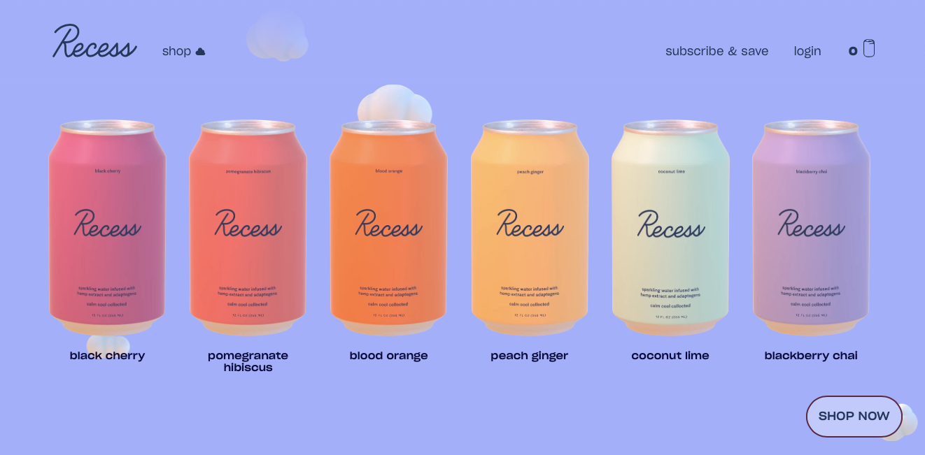
It feels a bit like what floating through the sky might feel like, if we were birds and had wings.
As you scroll, the page takes you on a whirlwind of experiences. Clouds are drifting by as the words ‘cool’, ‘calm’, and ‘collected’ gently sweep by on your screen, making you feel as serene as ever.
Six of their canned drinks line the bottom of your screen and as you hover over each flavor, be it their divine ‘Black Cherry’ or their refreshing ‘Coconut Lime’ your entire screen changes in color. When you actually click into one of the flavors, an entire personality awaits you. Each can has its very own personality, with likes and dislikes to boot! Such a clever and nifty idea of their copywriter, and perfectly strung together by their software developer.
The feeling of being transported up into the clouds is very real with their website, which matches their brand beautifully. The whole idea behind the brand is to bring calm and clarity. Both these emotions are deeply felt when scrolling through their site. Suddenly all the worries of the world slip away, and for those 10 minutes while you’re deciding if your best friend's new partner would prefer ‘Peach Ginger’ or ‘Blood Orange’, a decision that would usually leave you feeling stressed out, Recess’s website has you feeling oddly calm. A very welcoming and new sensation, we love it.
K2 Sports
(BigCommerce)

Not for the faint-hearted, let’s just start there.
The moment K2 Sports’s website popped open, I felt the little hairs on my arm rise and felt like I was at the Winter Olympics and everyone was staring directly at me. Heart racing and eyes wide open, the perfect feeling to have when you’re on a skiing and snowboarding website, isn’t it?
This site transported my right back to the Alps in Winter time. I immediately felt the cold and fresh air on my face, the exhilaration of new boots and skis on my feet and the excitement of the day to come.
Their website does exactly what it’s meant to, it has you missing the sight and feel of the wintry slopes, and gets your heart rate pumping with their introductory videos of skilled skiers in their element.
It’s so much more than just ‘selling winter sport equipment’, this website skillfully ties together craftsmanship, nostalgia, and ingenuity. They highlight the phenomenal quality of their products, whilst showcasing their equipment in a ‘real way’ through their videos, so that you can see the products in action!
Honestly, I’m going to visit the K2 website every time I feel a bit lazy because the energy that seeps through every pore of this website is infectious.
Larq
(BigCommerce)
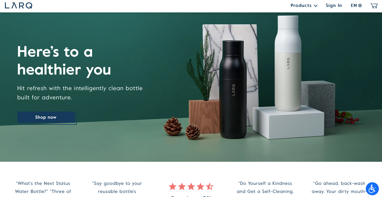
On the move water purification? Already sold.
To be fair, the meaning behind what water purification means has always been a bit murky to me (excuse the pun, ha!).
Larq couldn’t have made it any more clear than how they’ve visually explained it on their website, though. Their water filtration system on their Larq Pitcher PureVis and the GIF image they have of the pollutants being trapped in the filtering system and the water being purified is truly stellar.
When it comes to the technologically advanced Larq Bottle Movement PureVis and its UV-C LED light that allows you to drink purified water on the move, the feeling of simplicity and health are evident in the colors and the design they have decided to use on their site.
I can’t wait to get my hands on one of these!
Oliver Bonas
(Magento)
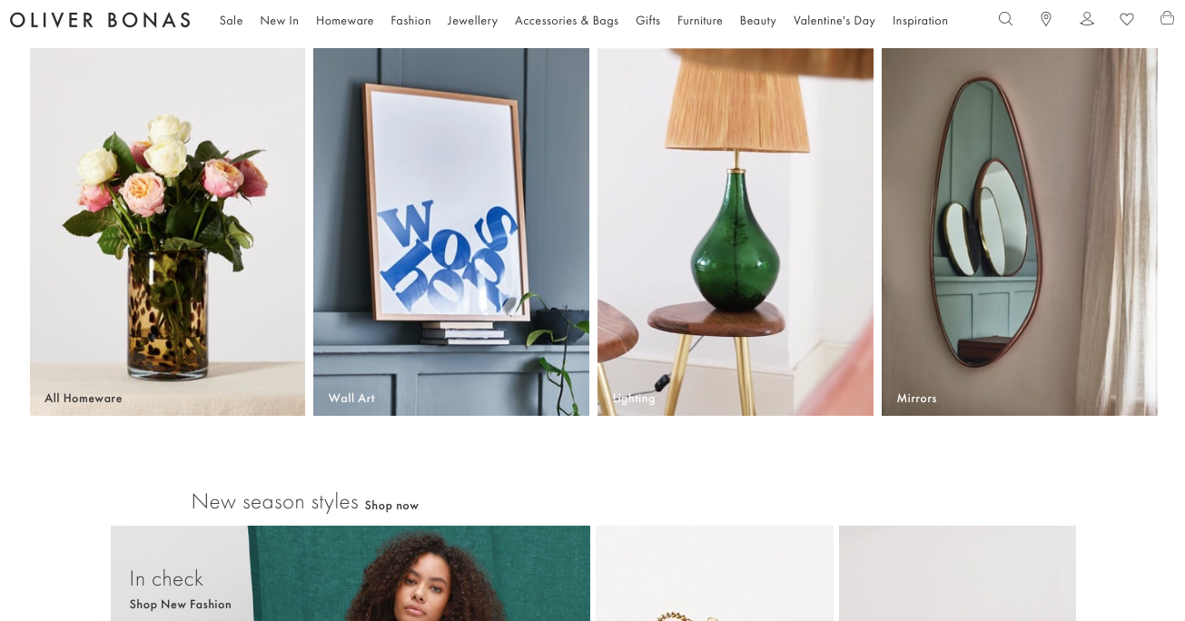
Hello, potential unnecessary spending. Good-bye, any guilt toward spoiling myself.
This site makes you feel like you just have to click ‘add to cart’ on every single item. Even the random bits that you’re not even sure how to use, or that they existed in the first place! For some odd reason, I want them in my cart too!
For a site with so much variety and so many products, Oliver Bonas has somehow still managed not to lose sight of the details. Which is precisely what this online department store and brand stands for: choice, flexibility, class and also an eye for design, color, and detail.
It’s lovely when you can read the intention of a brand and the brand’s image, through their website. When their tone of voice can be heard through the website itself, which is exactly what theirs does. And don’t forget the sheer volume of their site, the ease of use, the speed in which it takes the pages to load and the design features!
Cheers, Oliver Bonas, what a fun site!
AllBirds
(Shopify)
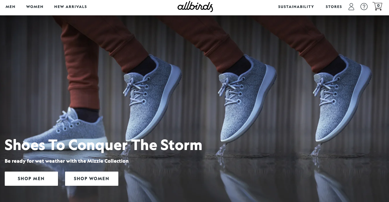
Shoe Utopia! (as well as apparel and sock utopia, actually)
It’s all about the story, the sustainability, and the origin of their products.
You see it clear as day on the video on their landing page. How they go from bamboo shoots, to carved wood, to sheep’s wool – it’s all a journey in time.
Their slogan is ‘Made from Nature, for Nature’ and that feel is clear in their homey yet also sustainable design on their site. Once you’ve gotten a feel for their landing page and start being intrigued by their individual products, you are in for a treat!
Each product is honest. That may sound weird, but it’s true and perfectly in line with the Allbirds brand. They’re an honest brand, selling honest materials and trying to create an honest future. The reason I say this is because not only do you see each product in minute detail/zoom function, but you also see the product in motion, how it sits on the foot, how you can run with it through the streets of your city come rain or shine.
Allbirds aim is, of course, to sell their products. But also to convey important messaging around the impact the fashion industry is having on the world. Two things that are difficult to tie together, which Allbirds has successfully managed to do. Their website seamlessly goes from ‘the perfect sock’ to a sustainability report.
I don’t know how they did it, but they’ve made learning fun!
Fielmann
(Shopify)
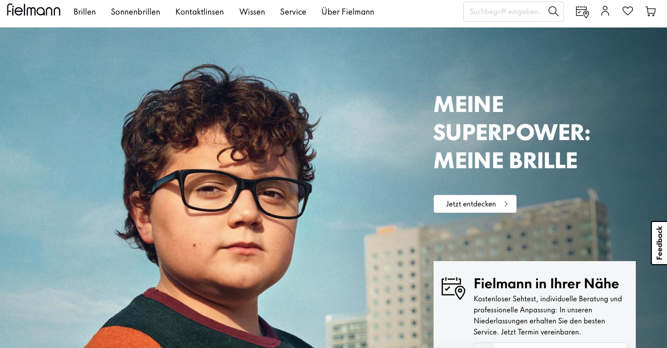
Loads of information and style all in one.
Browse through a massive catalog of eyewear with ease! Any company that has THIS much inventory and this many options would usually look outdated and be hard to use.
No, not Fielmann.
They’ve created a website that gives you an overview of all their products, perfectly divided and subdivided into categories. They have a useful video on their landing page that suits the perfect style/shape of eyewear to your specific facial bone structure, making shopping online for eyewear actually possible.
This depicts the type of company Fielmann is. Trendy, helpful and forward-thinking.
I always thought shopping for eyewear was something you had to do in-store, but with Fielmann’s videos and detailed description of their products, I am very close to hitting that ‘Go to Checkout’ right about now.
De Bijenkorf
(Magento 2)
https://admireamaze.debijenkorf.nl
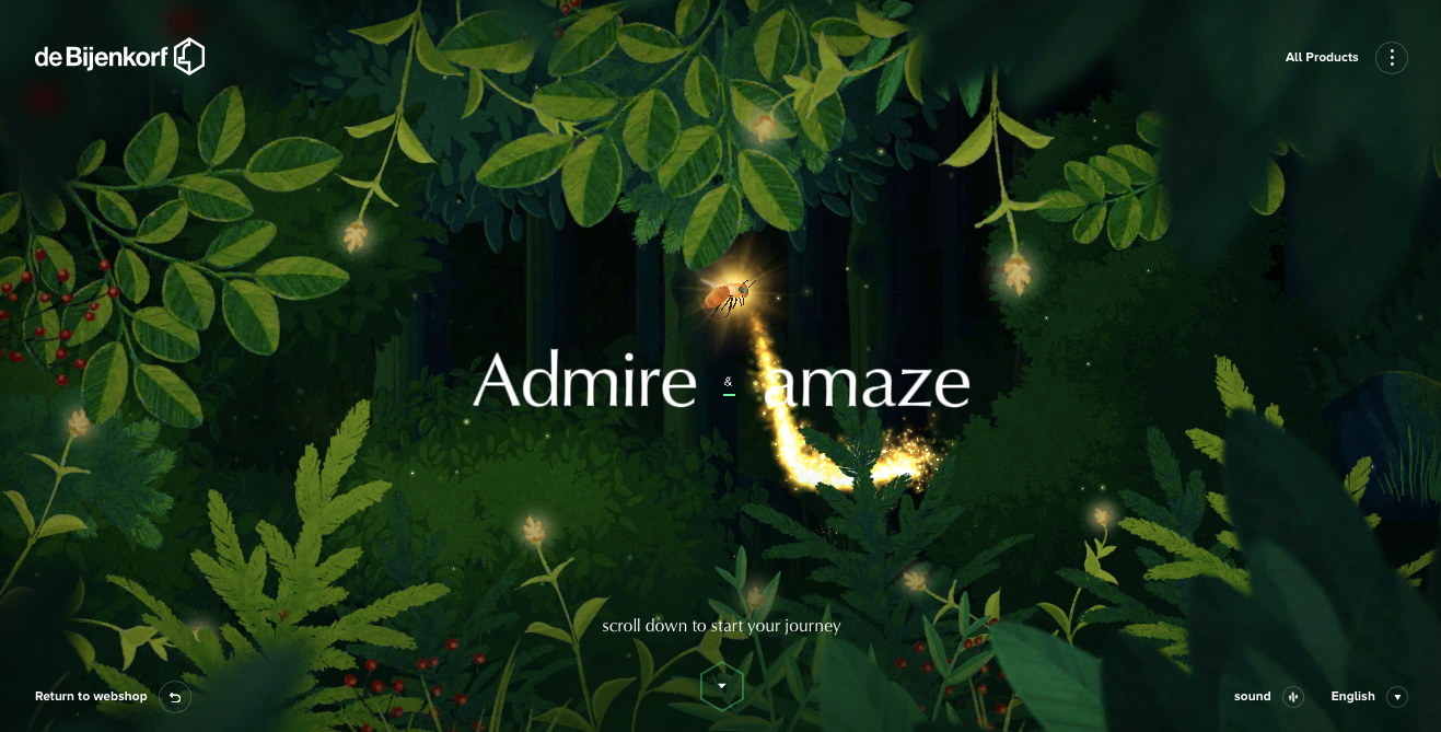
Hold the phone, this is the next level.
You sit waiting patiently, like a child in front of the chimney at Christmas, eyes gleaming, excitement bubbling up, but pretending to play it cool.
As the % continue to grow on our home screen, the excitement is almost too much to bear.
It’s like an enchanted forest, meets the world of 21st century tech. It is so bizarre and clever, that I’m still in awe.
You use your mouse to guide a bee through the forest, who then helps you discover all of their products. It is so forward-thinking and bespokely made. When you click on something, the sound of chirping birds and buzzing insects fills your ears as you make your way through the trees. I went from casually sat ‘Valentino’ sneakers, to floating ‘Toral’ knee-high boots surrounded by floating butterflies. I don’t think I’ve ever said a sentence as bizarre as that one in my life.
For a department store, this is truly remarkable. Actually, even for the future of websites, this is truly amazing. Standing ovation for de Bijenkorf!
Naked
(Shopify)
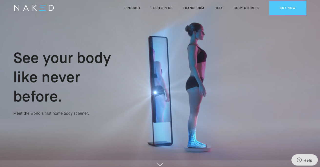
Do you remember the robot dance?
I ask because this reminds me of the fact that we are steering toward a very AI world. The world of robots and clever technology.
At the very top of the site, you already know exactly what this company is about. It’s brutally honest, just like the product they sell. The world’s first home body scanner.
The top video of the woman who stands before the mirror and then spins and turns into an avatar is very high tech and creative, which is directly in line with the product that Naked sells, so their brand image and the messaging one receives as an online visitor is exactly what the company sells. That’s always a great start!
As you scroll through the website, you see just how much care and thought was taken into delivering sensitive information when it comes to body fat and body image.
I’m a bit scared to get one of these myself, I don’t think I could handle that level of honesty, but their website is absolutely brilliant.
Plenaire
(Shopify)

Love it from the get go. A blank canvas with black little spots appearing all around.
The perfect background for a skincare company.
What are we if not a beautiful blank canvas with a few impurities here and there?
Everything about their website screams ‘cleanliness’ and ‘streamline’. I imagine their products are soft, lightly scented and simple in terms of packaging.
*clicks on product*
Yes, that’s exactly what I was expecting. The drag function that they have at the bottom of their page so that you can look through their entire range is helpful and functional. Simply click on ‘Discover’ on any of the products, and you will be transported to all the information you could possibly need when it comes to skincare products. You see the packaging, you see the cream as it naturally is, you see a stunning model’s skin glowing from said cream, and then it leads you to an easy-to-read list of benefits and fragrances.
Moooi
(Wordpress/WooCommerce)
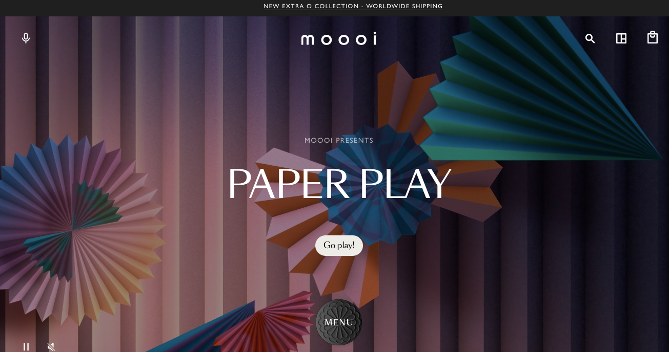
It’s exactly as the name says in Dutch – beautiful. I may even go so far as to call it ‘breathtaking’.
Delve into the world of design with this stunning showcase of their latest products.
It’s exactly what you’d expect from an innovative design empire. Visually top-notch, inviting, and it really sets the mood for what is to come.
Whenever I look at a design house’s website, I’m always surprised by their lack of innovation. This certainly isn’t the case with ‘Moooi’. They allow you to picture exactly how one of their coffee side tables may look in your living room, or how a bright wallpaper might spruce up your slightly dark bathroom.
They’ve created a wonderfully inclusive website, that you can hear, and almost feel and touch. Not only that, but they truly have made a space where you have the desire to reach through your screen and touch the soft pink fur lining a couch.
Honestly, all I can say is, what a pleasure and privilege it has been to use the ‘Moooi’ online shop.
Conclusion
It’s certainly not easy to create a bespoke and unique website. It takes time, manpower and a large budget. When you click on these companies' websites, though, it’s so easy to see just how worth it, it is.
Like our Co-Founder, Malte Dietrich always says: ‘Every customer touchpoint is a way for you to represent your brand’. Which is so true. So, why not ensure that every touchpoint is as magical as possible?
The onus is on you.
If you’d like our expertise creating a headless website, be sure to contact us through our website or email us on hello@especial.digital
Found this helpful? Share this post with your colleagues and friends
Natalie Miller
Marketing ManagerCONTACT US
Would you like to know more?
Let us help you!
Learn more about Shopify & Headless?
Take a look at our Guide to Headless Shopify and see, how to leverage the approach to gain freedom and take your e-commerce approach to the next level.